
My Role
UI/UX design, Project Management & Business Analysis
Duration
3 months
Tools
Figma
Notion
Miro
MS Power Point/Canva
Team
4 UI/UX Designers
1 CEO
1 CTO
1 Mentor
1 Financial Advisor
15 mins read
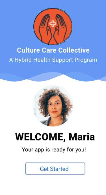
Culture Care Collective
Connecting low-income patients with health support
How Might We Create an AI-Enhanced, User-Friendly App That Connects Cynthia & Issac with Their Ideal Users?
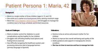
Cynthia and Issac, the founders of Culture Care Collective, had an idea to help connect patients in marginalized communities with healthcare workers, providing guidance on managing their health conditions. Although this was a novel idea, the initial product that was built had limited components which hindered the functionality for its target users.
Our challenge was to design a platform that combines intuitive functionality with cutting-edge technology, delivering both the experience and engagement they envision.
Multiple Chronic conditions were highly prevalent among adults 18+ in Arkansas, Kentucky, Alabama and West Virginia.
Over the weeks, we developed a great deal of empathy for the many minority groups especially the ones in the low income bracket trying to navigate through the health system. Through our research process and with a help of a clear problem statement we were able to navigate through the process.
"How might we be able to bridge the gap between underserved patients with Chronic Health Conditions and hospitals with the help of CHWs?"
Through research and by talking to health care workers we tried to understand the Go to market
Challenges
Identifying the Right Target Audience & Market Demand: While university students are currently the primary users, it is essential for CCC to understand the right target market ensure long-term business growth and profitability.
Team Collaboration: Building trust within the team and effectively utilizing each member's strengths were initial challenges, especially under a tight three-month deadline.
Consistency in Design: Ensuring design consistency between community health worker screens and patient wireframes was difficult, highlighting the need for proactive team communication.
Application Development Direction: Initially there was a lack of clear direction on integrating AI features into the application, making it challenging to define what the application will achieve.


Solutions
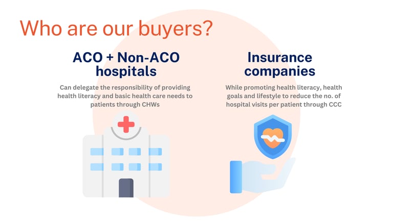
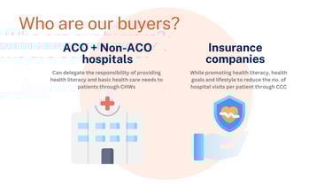
Target Buyers: My team and I identified ACO and Non-ACO hospitals and insurance companies as target buyers, aiming to promote health literacy and lifestyle changes to reduce hospital visits per patient through Culture Care Collective (CCC).
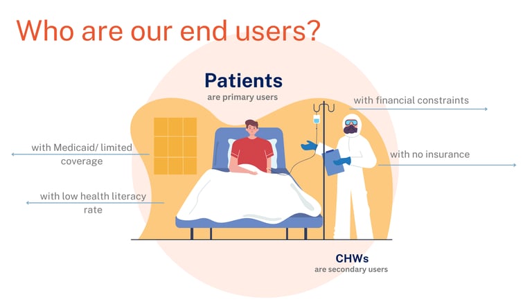
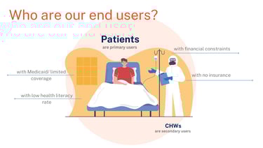
End Users: We recognized patients as the primary users and community health workers as the secondary users of our product.
Quality Measures: We aligned our product with the quality measures used by ACO hospitals, including timely care, effective doctor communication, health promotion, and screenings for weight, depression, and blood pressure.
Business and Revenue Model: We created a B2B model with a fee-for-service structure and a subscription-based model, allowing healthcare providers and insurance companies to access a pool of community health workers.
Prototype Development: We developed a prototype for patients and community health workers, prioritizing must-have and should-have features while integrating some nice-to-have features for a comprehensive solution.


Before
After
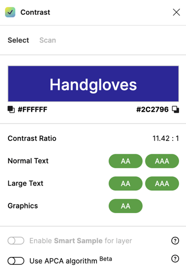
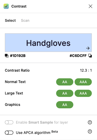
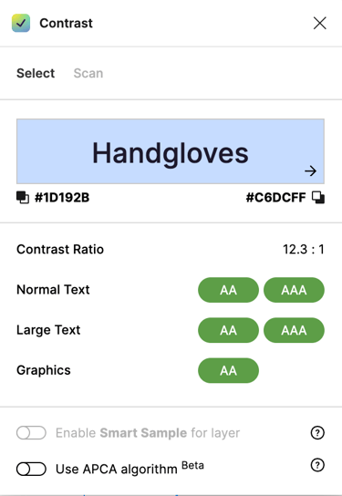
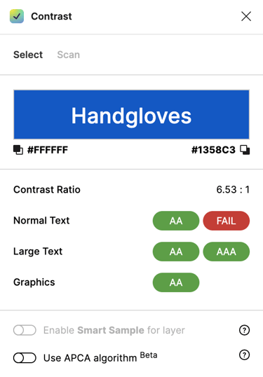
Building the design system with the help of one other designer
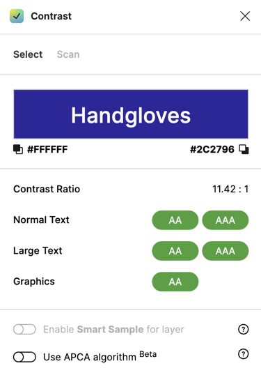
Using Google's material design, we created a custom design system that meets theWCAG guidelines to our screens are accessible to all.

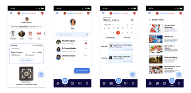
Key Design Improvements I contributed to
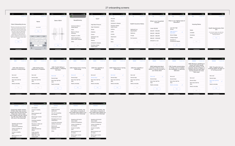
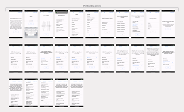
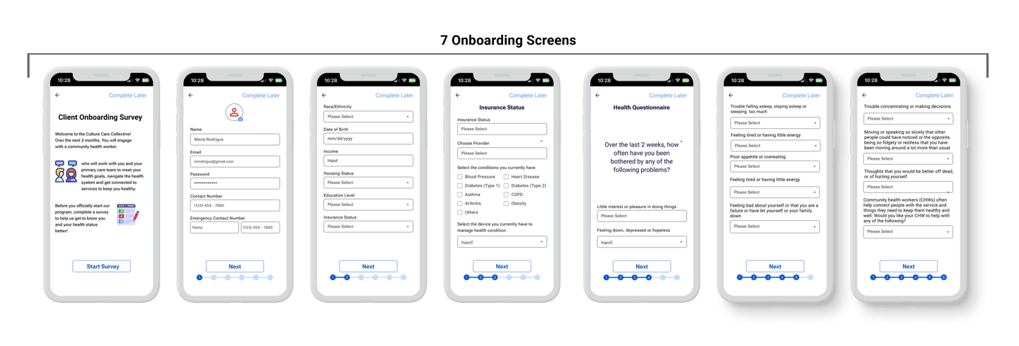
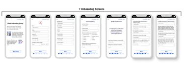
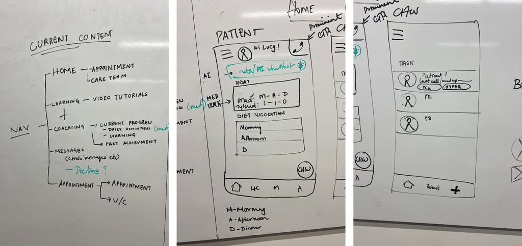
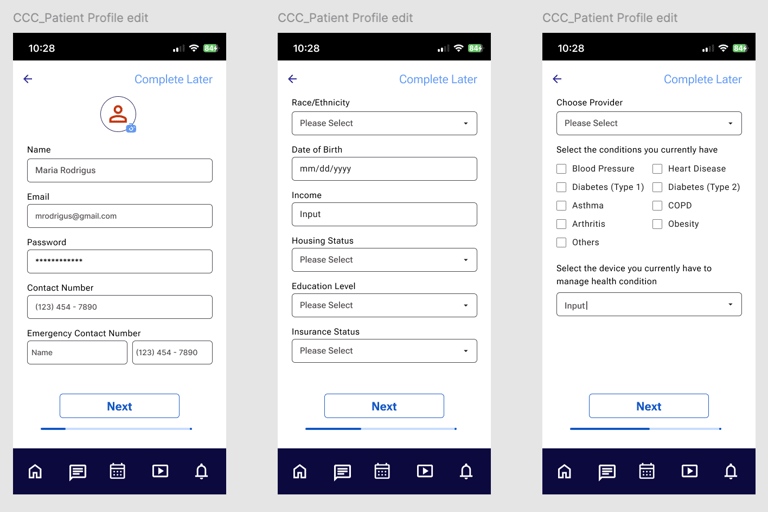
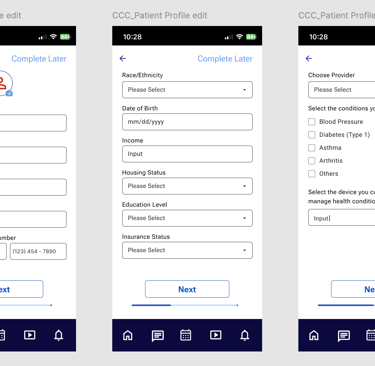
From 27 onboarding screens to just 7
We restructured the onboarding flow into four concise sections to efficiently gather necessary information with a clear progress bar.
Section 1: Personal Information
In the first section, we collect essential personal information including the user's name, age, and contact details such as mobile number and email address.
Section 2: Socio-Economic Details
The second section gathers socio-economic information from users. This includes their race/ethnicity, date of birth, income, housing status, and education level.
Section 3: Health Insurance and Condition
In the third section, users provide details about their health insurance status and specify any chronic conditions they have.
Section 4: Wellbeing Assessment
The final section consists of a series of questions aimed at understanding the user's physical and mental wellbeing.
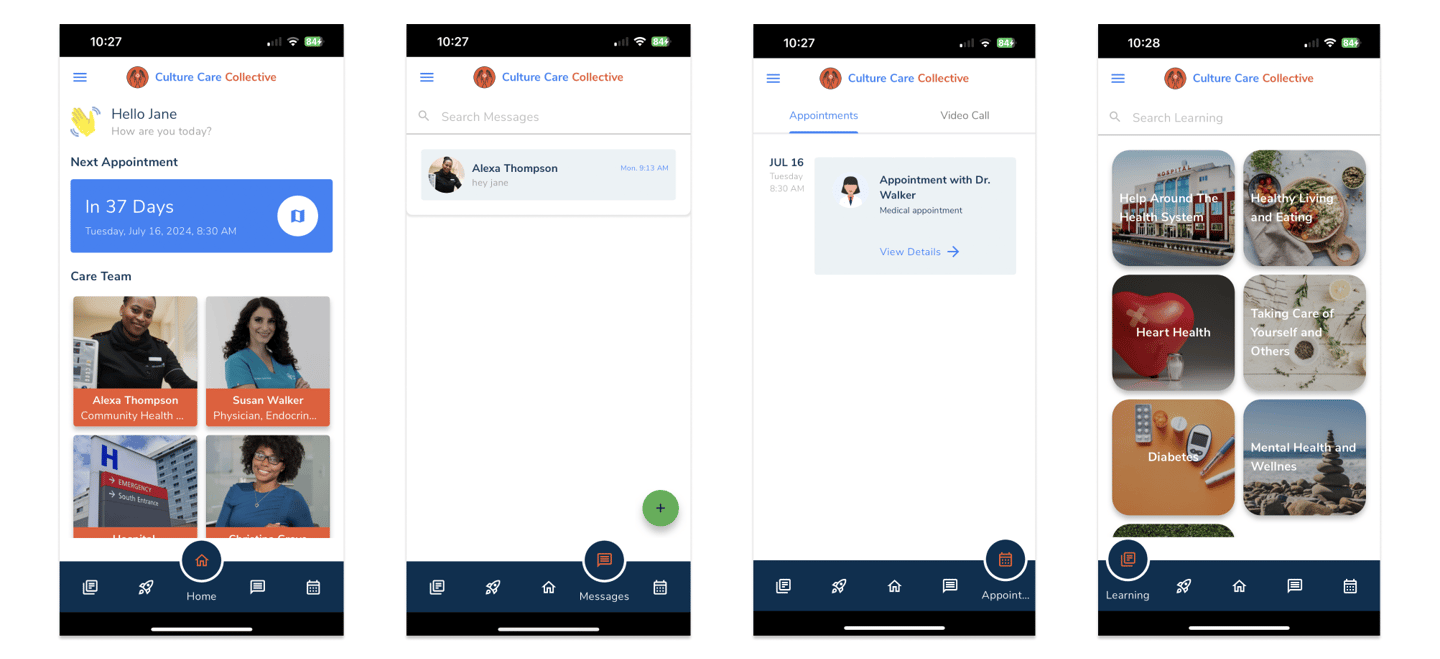
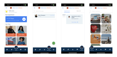
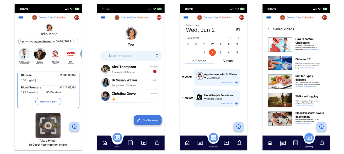
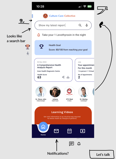
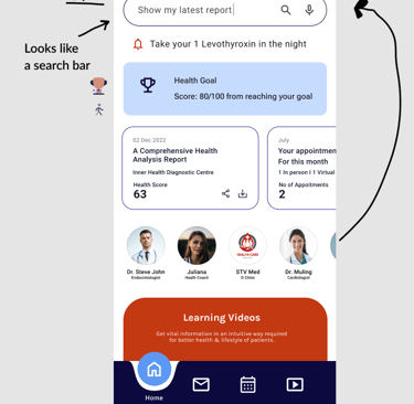
Customized Home screen
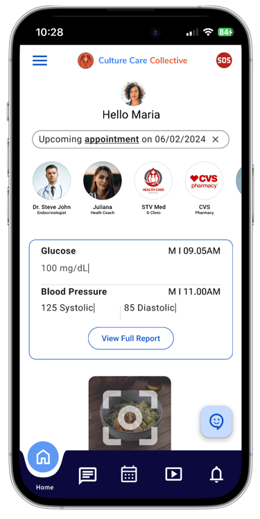
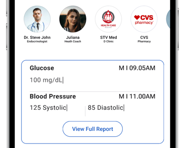
With access to care providers and option to enter their daily readings to understand their health progress
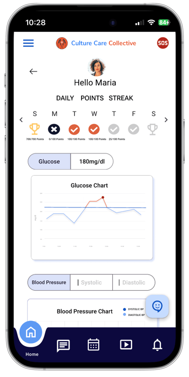
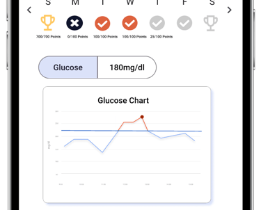
Health Report
A gamified health report that celebrates their health and help receive incentives based on their progress.
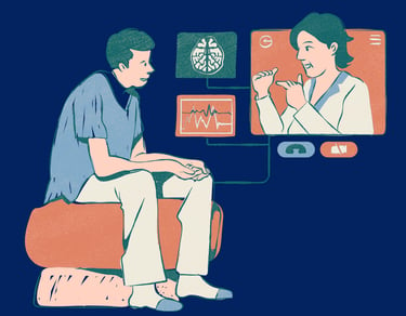
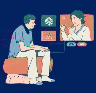
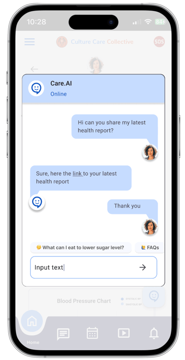
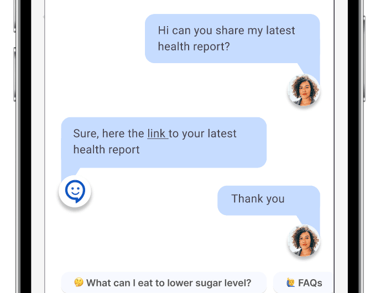
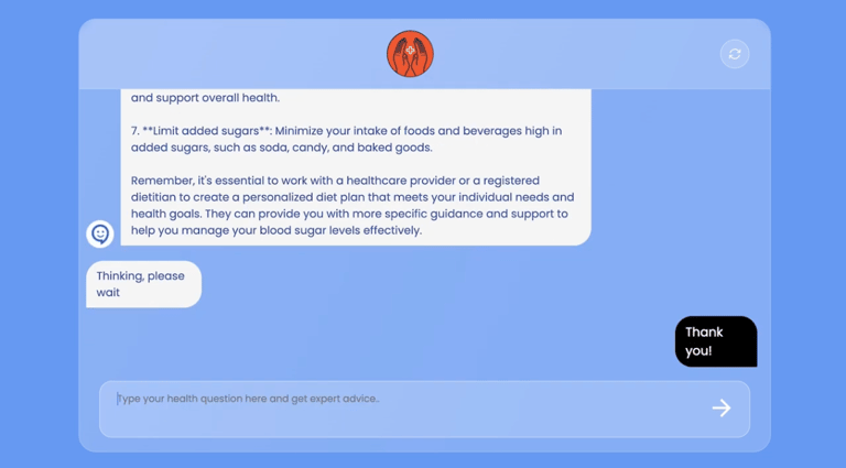
Ability to get quick clarifications or health guidance with the help of the health care AI bot.
AI chatbot
Through our research and competitors analysis we understood that Culture Care Collective has the potential to include many valuable features that would add value to their end users and clients
Keeping the competitors analysis as a point of reference, we conducted a Feature Prioritization session and User Story Mapping
Ask per the ask, AI Chatbot was a must have feature
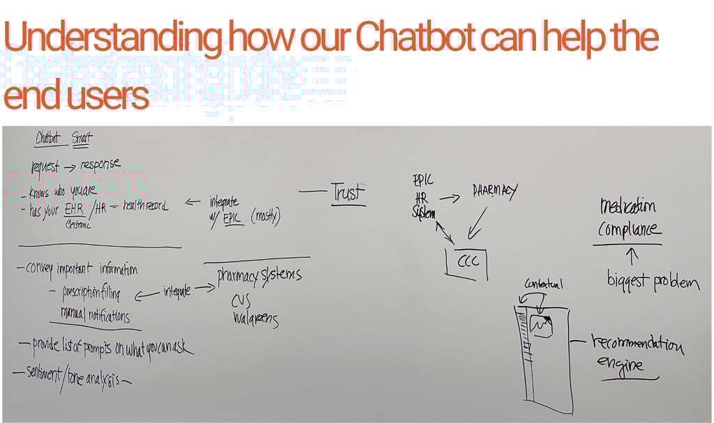
I wanted to explore the opportunity of building a health chatbot for our project using OpenAI APIs with Postman and testing it out, I created a fully functional chronic health advising chatbot using HTML, JavaScript, and CSS. By leveraging Postman, integrating OpenAI GPT-3.5 Turbo model, I was able to deliver engaging conversational experiences. I defined user and system rules, customized messages, and guided the chatbot's behavior, enhancing the user interface and experience.
Click below to chat with out Chronic Care Advisor chatbot
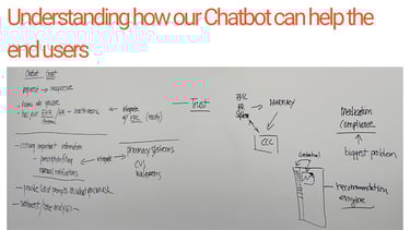
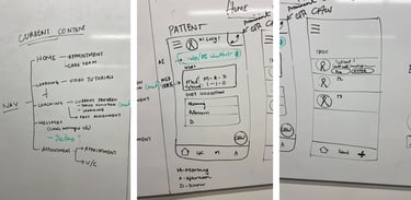
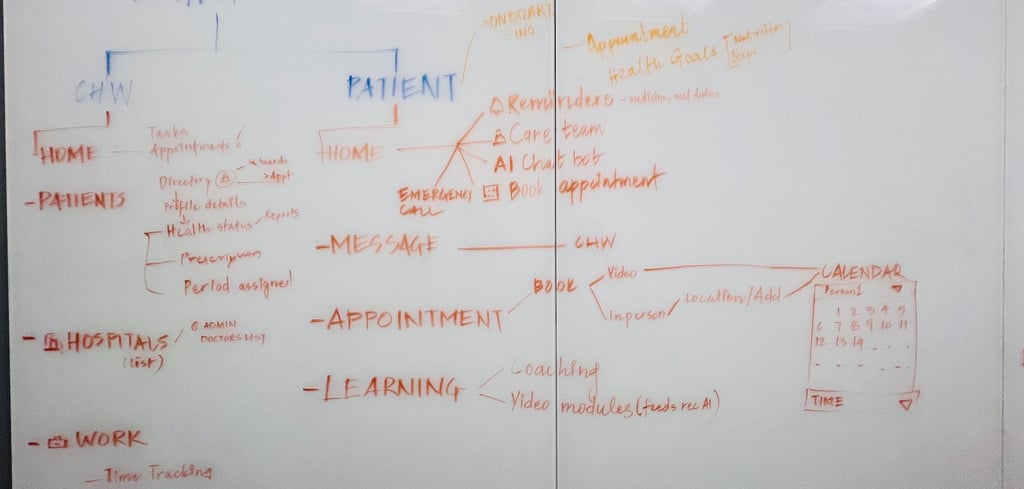
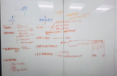
We conducted 3 white board sessions, in the first session guided by our mentor we established a clear user flow, then we moved on to sketching different screens, using our user flow and MVP feature list as our reference points. At this stage, we weren't concerned with style or aesthetics; instead, we embraced a free-flow approach, sketching various designs to explore all possible options for screens, interactions, and gamification elements.
We focused on ensuring that our designs were user-centric, considering the end-user's journey and needs throughout the process. By prioritizing functionality and user experience, we laid a strong foundation for further refinement and development.
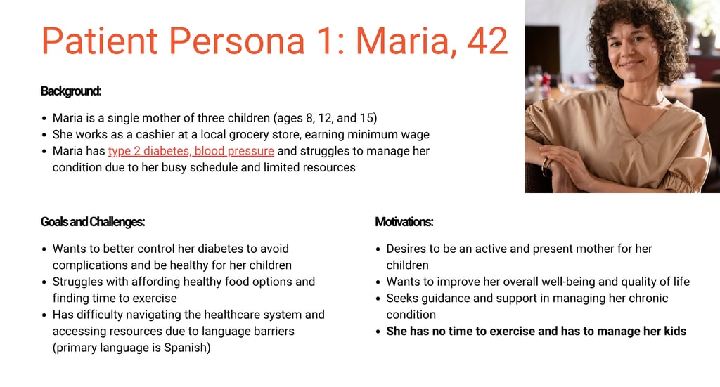
Using Maria's persona, we built out the high-fid prototype, Once we started designing, we had so many diffrent ideas, the progress bar we initially designed was similar to what CCC had but it has very little significance or impact since it was still hard for the users to understand how many more screens they will need to fill out to complete the onboarding. below are some of the initial feedback that we received for our high fidelity prototypes from the stakeholders.

Client feedback
“I am really super proud and super happy that you were able to embark on the challenge, work really well together, proactively work through the short amount of time, making it work, thank you!”
- Cynthia
Forbes 30 Under 30 Boston

Information contained within the projects is solely my own and may not necessarily align with the perspectives of the respective companies.
All projects adhere to the terms of any NDAs Signed.